


When Beans was first engaged by the founders of YOLO, one of the biggest challenges for the group was finding a name. Many funeral businesses are legacy operations, built on the back of a family name or the name of the owner-operator. The owners wanted to create a business that was modern and scalable and so to use one person’s name was not going to meet this ambition.
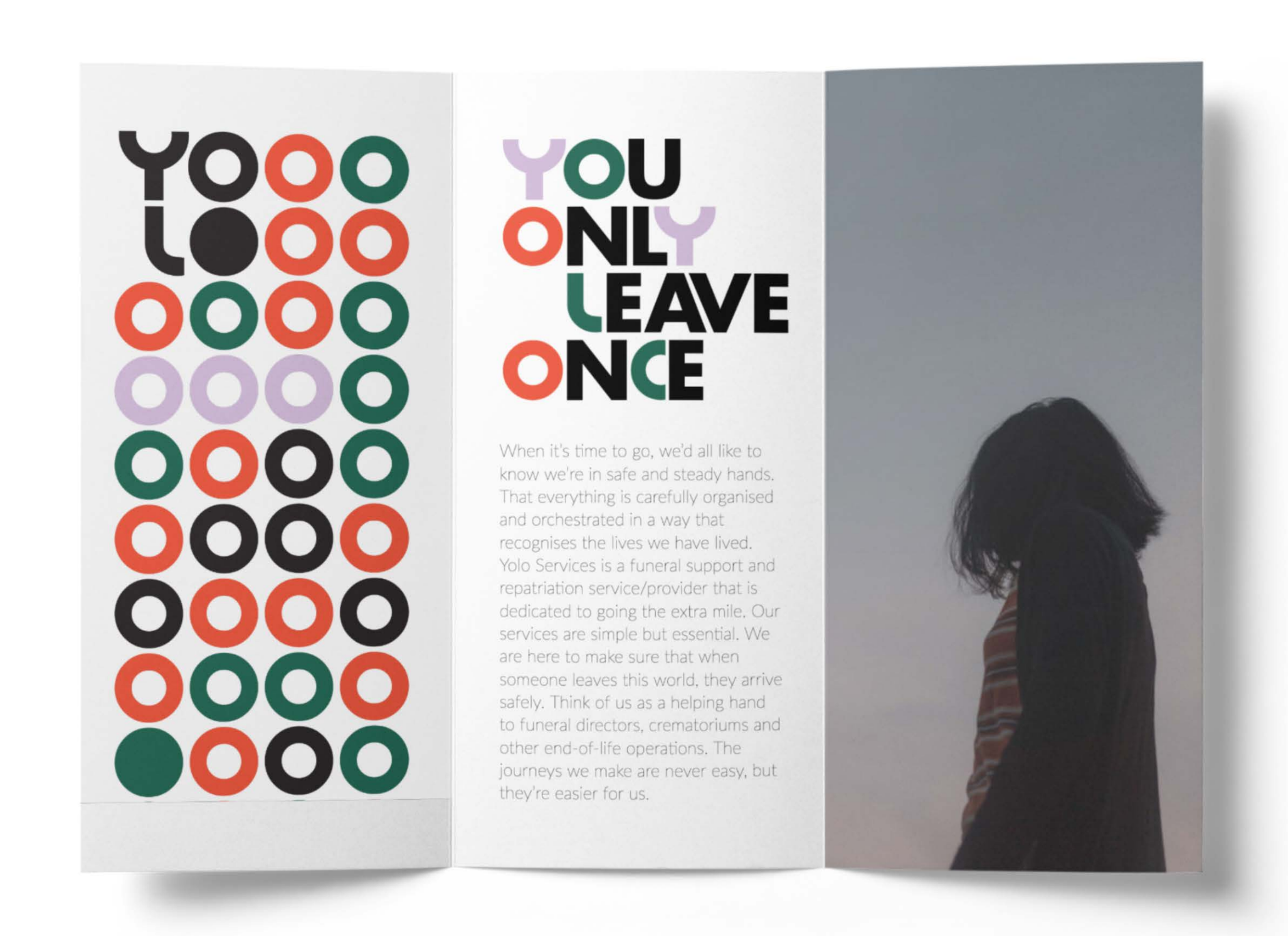
We needed to come up with a name that recognises the beauty and individuality of life and speaks to the heart of what YOLO and its directors believe in.The tongue in cheek term YOLO came up during one of our workshop sessions, and what seemed humorous at first, soon started to stick with the founding team members. But with one small change to the acronym. A gentle reminder that our exit only comes along once in a lifetime.
Playing on the popular acronym, we worked with the team to create a name that captured the depth and richness of the people involved and the people they were to work with, while acknowledging the fragility of life.This delicate change to a term that originally aimed to spur a ‘carpe-diem’ attitude was now about the journey we all go on. Starting from birth and taking us on our own path through life before our ultimate exit. That’s how we developed the name and phrase, ‘You Only Leave Once’.
This reflects YOLO’s commitment to making someone’s final journey a thoughtful one. One that respects and recognises the individuality of every person’s life, with a smile.
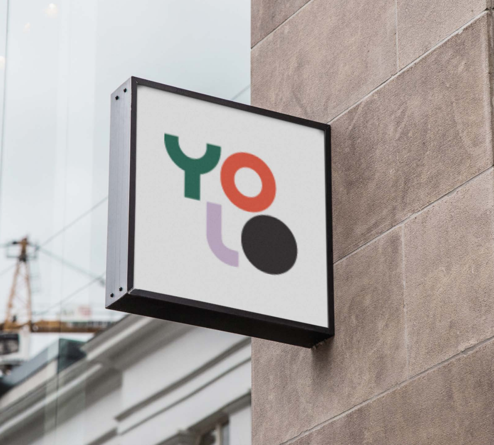
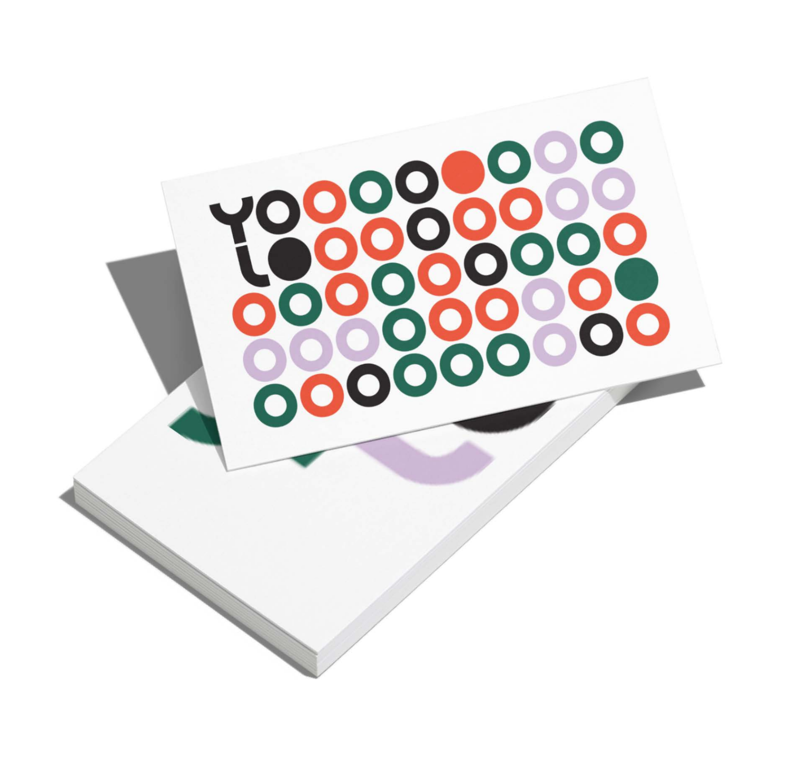
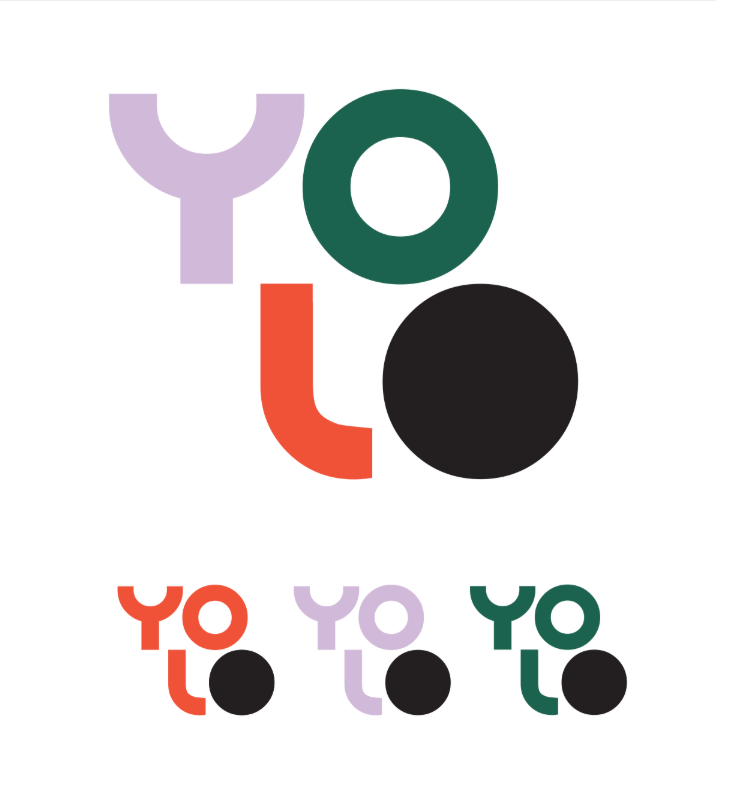
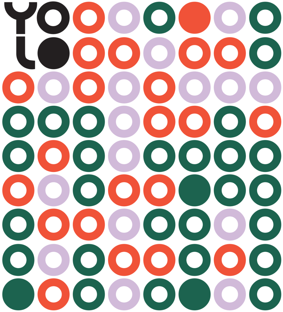
The theme of recognition is woven throughout the brand. From the custom geometric typeface used in the logo, to the bright and celebratory colour palette.
We adopted bright hues, including lilac, verdant and sunset, to reflect the richness and fullness of life and black to represent the grief and sadness we feel when it’s gone.
These colours aim to capture the wide spectrum of experiences and emotions people have toward funerals, as well as the individuality of each of us. The combination of colours together represents the importance of community.
All of these ideas are things YOLO seeks to address and acknowledge in the services they provide and the way they provide them. We paired these colours with an accessible font named Futura to create a modern brand that stands out against the traditional styles predominant in the funeral industries all over the United Kingdom and the western world.

.jpg)