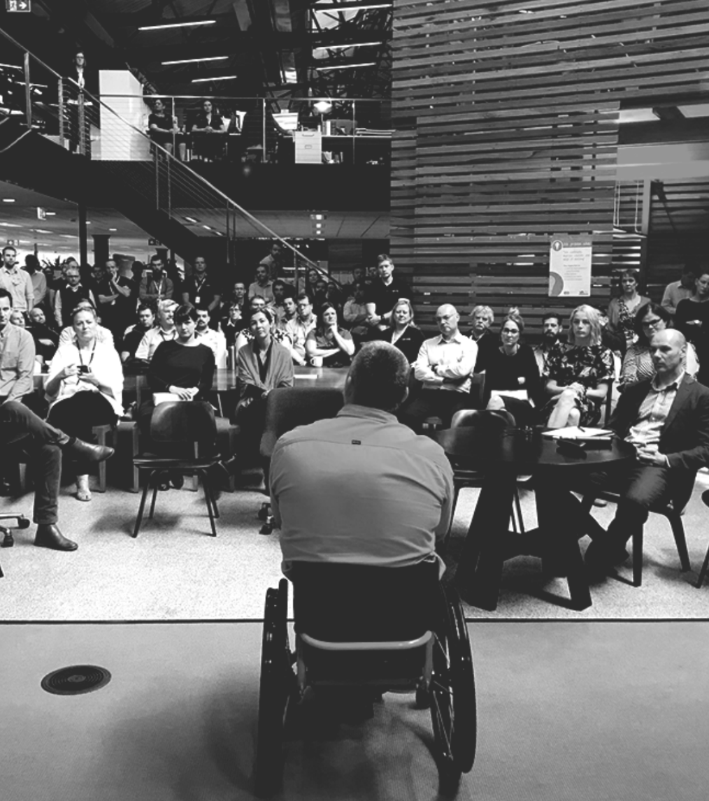
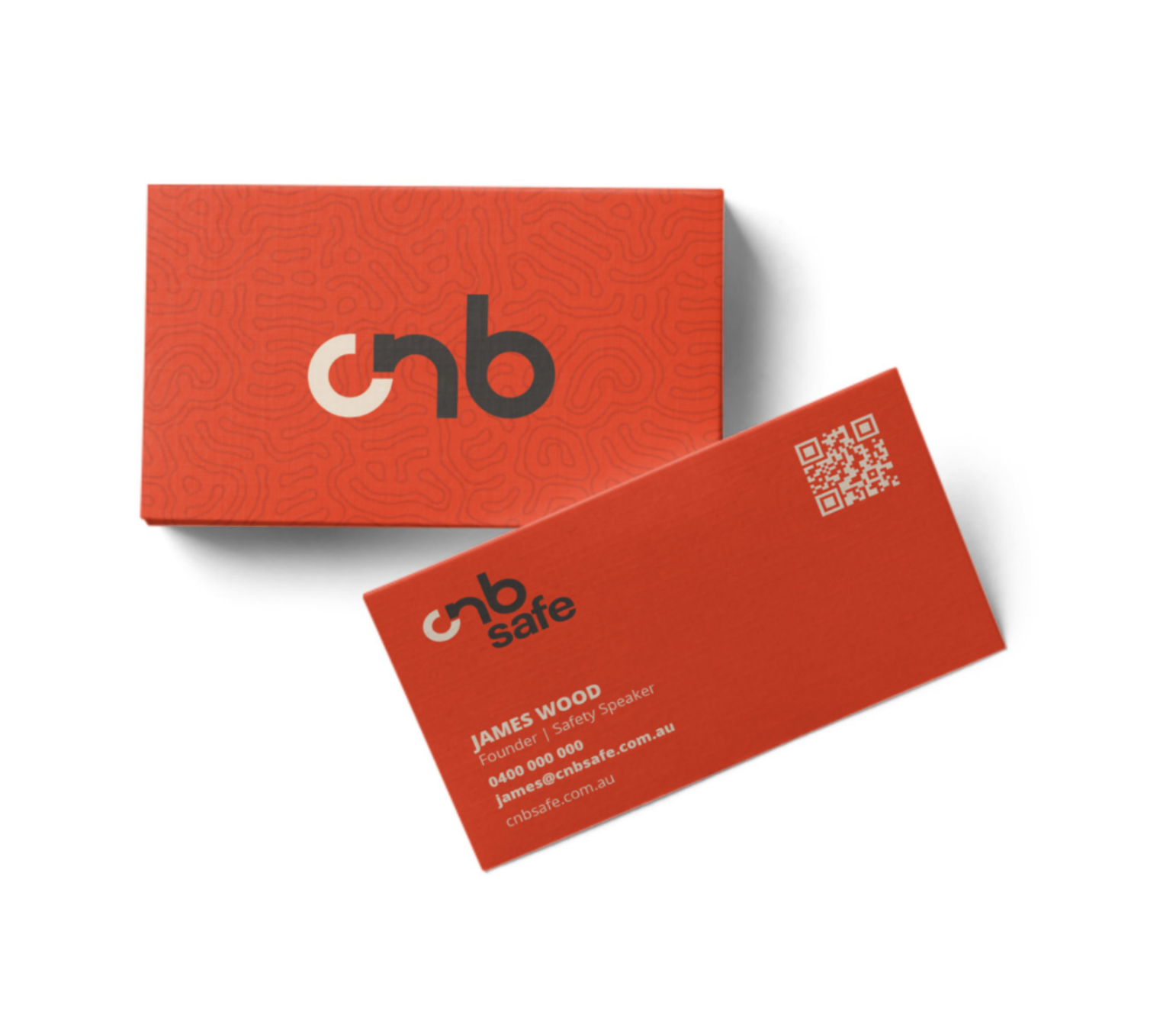
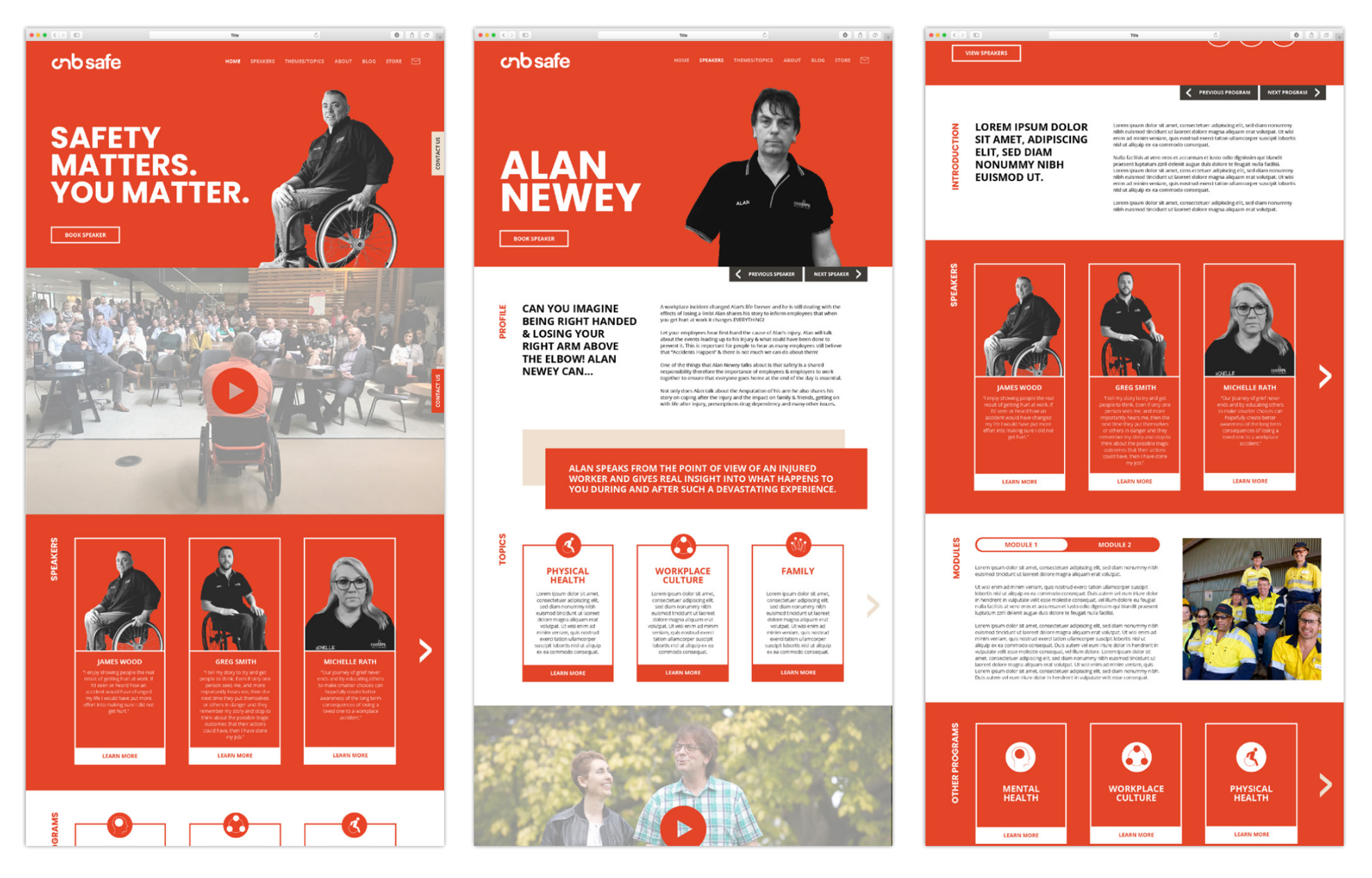
CNB Safe

2020 and 2021 have become synonymous with change. All over the world, the way we live and interact was challenged and pushed into new territories – it was in the midst of this that global safety speakers, CNB Safe, decided to change everything.

CNB Safe
CNB Safe

RESEARCH

To begin, we carried out an extensive research program about perceptions of workplace safety. This was designed to question assumptions and confirm learnings from CNB Safe’s many years in the speaking business.

This research took us into the psychology of safety; how fear and perceived risk can influence behaviour, the way responsibility is delegated and the importance of storytelling across all of these things.

It also pushed us all to consider how the conversation around safety in the workplace is changing. Nowadays, it extends beyond physical injury and includes a more holistic understanding of an individual or group’s wellbeing. Safety now covers everything from mental to cultural to physical and even the impact it has on the broader community – and families at home.

As this new safety narrative came together, it transformed the way CNB Safe were communicating internally and externally. Their own stories were changing. And so, when 2020 came to an end, CNB Safe was ready to start moving toward 2021 with a new perspective.‍

REBRAND

To begin the rebranding process, we questioned the assumptions that were built into and around the existing CNB Safe brand. The name, the logo mark, colour palette, typography, imagery and tone of voice had all come together over years and years of business growth. It was time to redesign and realign.

We pared back the layers of the existing brand, taking away as much as we could until there was only the bare elements left: the orange, the wheelchair and the message. The orange is synonymous with the brand and the hi-vis clothing that their audience of our speakers so often wear. The wheelchair is representative of the challenges faced and overcome by CNB Safe’s founder Woody. The message is the power of storytelling to influence behaviour.


CNB Safe

THE HEROES WHEEL

There was a lot of healthy discussion about what to keep from the previous brand and its related entities. Many of these earlier brand assets had meaning when Woody first started the business but was it still relevant? A wheelchair in a related logo, for example, was one of the key elements under questions.

In some ways, the wheelchair had come to represent Woody’s experience and his story. Would CNB Safe exist if Woody wasn’t in a wheelchair? We decided to keep the wheelchair in the branding, but modernise and integrate the symbol.

In the world of branding, creatives will often seek out hidden meaning for the brands they make. When this meaning presents itself, we call it a gift.

You’ll see the C is ¾ of a full circle and almost the same shape as the wheel in the universally recognised wheelchair symbol. This is an acknowledgement of CNB Safe’s history and founder, James Woods, who was injured in a workplace accident and has been in a wheelchair ever since.

The circle also has an additional meaning. American Professor and narrative expert Joseph Campbell has done an extensive catalogue of work on the hero’s journey. This narrative structure is present in all of the world’s most famous tales, from Star Wars to Wizard of Oz to ancient Greek mythology. Campbell’s theory is often visualised as a circle, whereby the protagonist or hero journeys from a world that they know and feel safe in, to a new world where they face an insurmountable challenge. Through trial and error, the hero perseveres and overcomes these challenges, bringing them back to a new normal where they feel safe once again.

This is why the wheel in the C of the logo mark is so important – not only does it represent Woody’s journey and challenges, but also those of CNB’s speakers.

It’s also where the logo begins and flows through to the N, kind of like a story. The B is fluid and loops back on itself. The circular theme is present throughout, with a slight detour in the N, because sometimes you go the wrong way.

CNB Safe

Our design team spent a lot of time trying to find the right orange. Originally, the orange was inspired by the hi-vis workwear that Woody and so many of the speaker’s audiences wear every day. Yet, this isn’t the only reason it stayed. The new orange has a deeper tone, titled Red Rust referencing the earthy environments that CNB Safe frequently visits on mining sites all over Australia.We brought this orange together with a charcoal, a brown and a clay to create a retro, yet modern tone for the CNB brand.‍

THE MESSAGE

The message for CNB Safe has always been at the heart of what they do: they believe in the power of storytelling to influence behaviour. In their line of work, they are actively trying to influence people to behave in a way that ensures everyone’s well-being; the safe way.

Anchored in CNB Safe’s history of raw and motivational speeches, we developed a succinct message to use across their brand that encompassed the brand’s purpose and offering; “safety matters, you matter”.

The headline challenges the audience to put themselves at the centre of the safety story and to consider what would happen to their world if they were to have an accident. It speaks to all layers of the audience, from the Chief Safety Officer to the worker.

CNB Safe

When creating a new brand or re-branding, Beans always considers a pattern to tie the brand, colours and style together, offering our clients an artwork that represents their business beyond the logo.Yet, a pattern for CNB Safe had a more important job to do. It needed to be less predictable, less complacent. This is where the idea for the windy, hard to follow topographical pattern came to be. As many of the challenges around safety are due to the complacency of workers, the pattern couldn’t be like groundhog day, it had to challenge the viewer.


CNB Safe

The next step was to provide CNB Safe with a platform from which they could share and inspire others. To do so, we developed an array of content including print material such as brochures, business cards and banners as well as digital content for social media, EDMs and their website. To create continuity, the new brand colours and style were integrated throughout, with pieces of the pattern thoughtfully placed to continue the subtle reference to the workplace and connection with the audience.

CNB Safe

A crucial step to help CNB Safe connect with more customers was to update their existing website and provide more accessibility and functionality. As well as changing the design and tweaking the layout, we added more interactive components, including videos, to bring the performance to the screen. Paired with the credibility of customer testimonials, this has created a more engaging online experience and helped CNB share their message of safety with more of the right people.‍

THE STRATEGY

Like all good stories, successful brands also need memorable conclusions that leave the reader hungry to see the author’s next bestseller. For CNB, this included implementing a communication strategy to connect the refreshed brand with their audience. Central to this process was building out a database of contacts and identifying their relationship and investment in the brand. By doing so, CNB are now sharing snippets of their story with customers who are eager to read the next page.

It has been a long and interesting journey to create the new look for CNB Safe. We asked a lot of questions, uncovered many more answers and have thoroughly enjoyed helping them write the beginnings of their next chapter in workplace safety. CNB Safe and their speakers are now prepared to enter their next stage of growth as they pursue new opportunities with the confidence of a captivating new brand.


CNB Safe
CNB Safe
CNB Safe