


A vital community pillar, SASSI offers safety, support, and empowerment to people in need throughout the Illawarra and Shoalhaven.
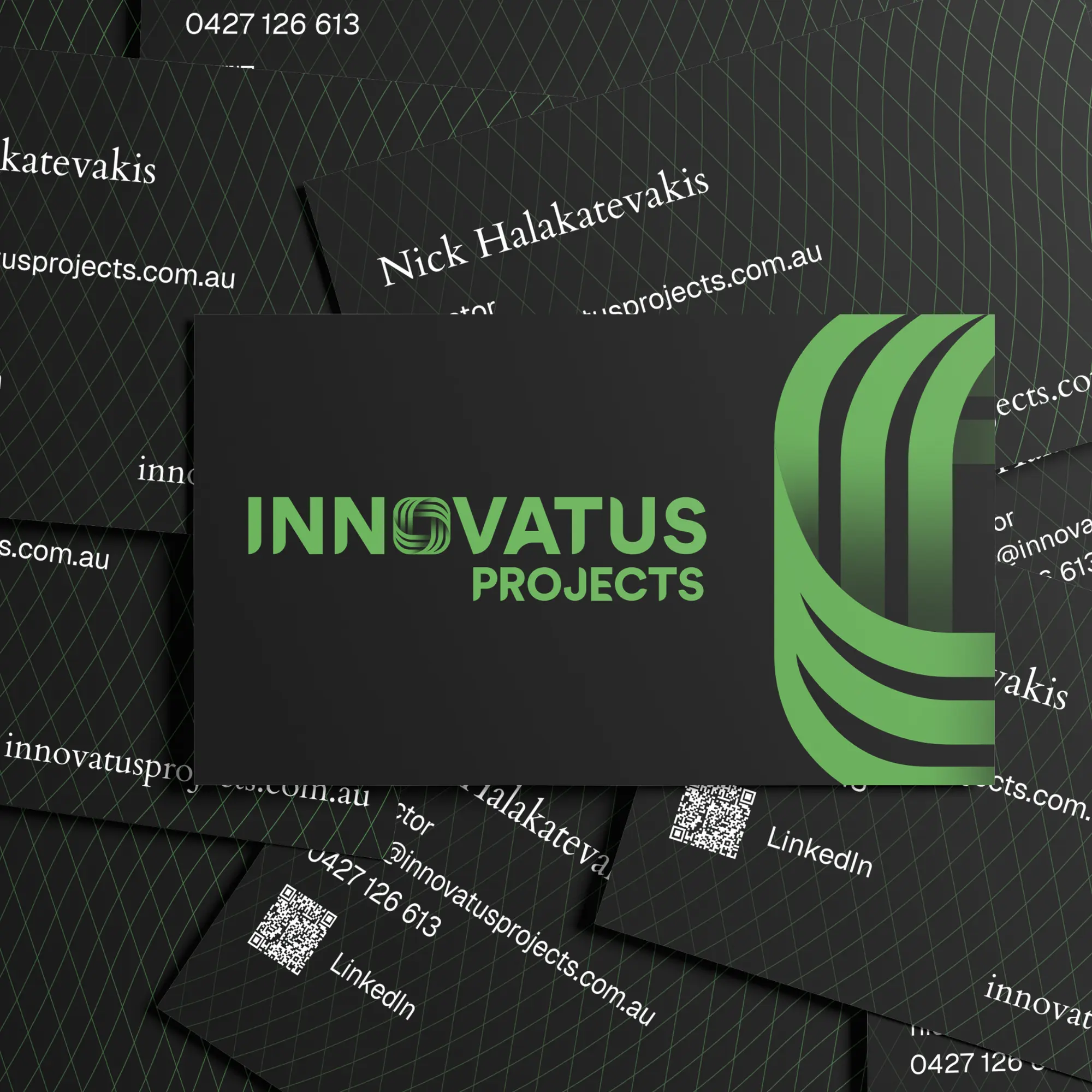
Beans worked closely with the SASSI team to undertake a comprehensive strategic rebranding, including market research, name refinement, visual identity, corporate stationery and a complete digital and collateral overhaul.
The primary objective of the strategy was to dismantle the barriers created by the existing acronym "SAHSSI." Research uncovered during a survey process revealed the name was difficult to pronounce and remember, often causing staff to describe their services rather than lead with their brand.
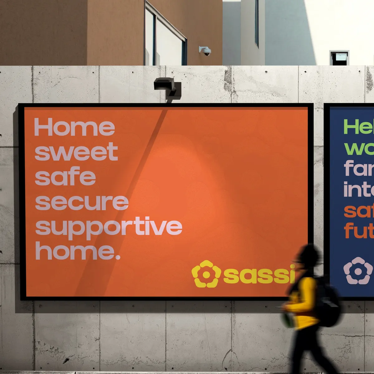
The goal was to create a simpler, more intuitive identity that maintained brand heritage while prioritizing a "Get Help" first approach for clients in crisis.
Refining the name to SASSI provided immediate clarity while preserving established community goodwill. The visual identity was built on a foundation of vibrant colours to communicate diversity, bold typography to represent safety, and storytelling through interview-style content creation.
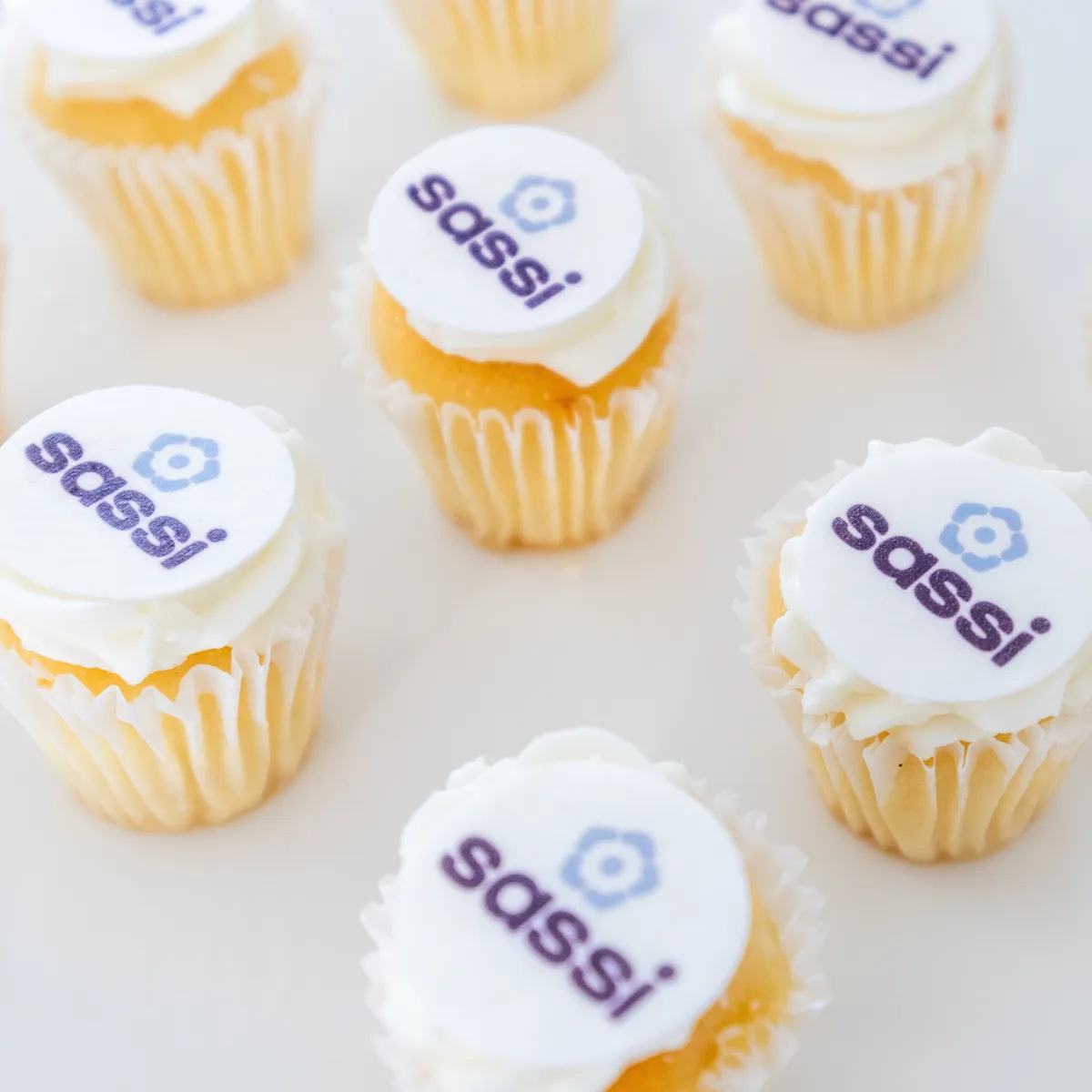
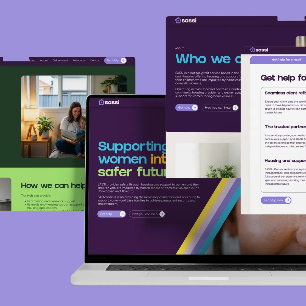
The brand was rolled out across a WordPress website, followed by a comprehensive suite of physical assets including business cards, brochureware, signage, banners and uniforms. To support the launch, Beans produced a series of impact-focused videos and a "What does SASSI stand for?" content series, culminating in a coordinated public release in time for International Women’s Day 2026.
Working on meaningful projects for impactful organisations like SASSI is exactly the reason why we love what we do at Beans.
.jpg)